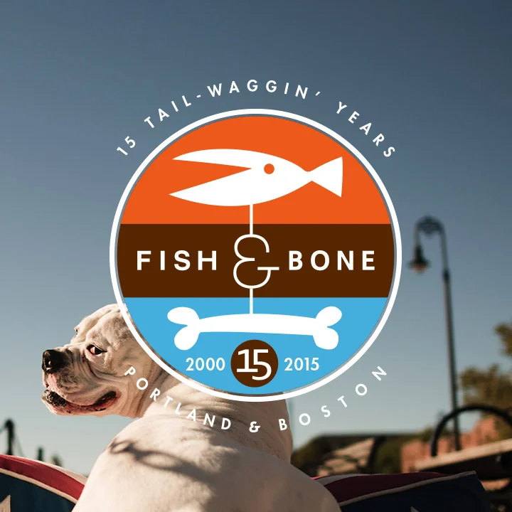
To celebrate their 15th year of business in Boston, MA and Portland, ME my wife and I teamed up to create a host of campaign elements and applied them on everything from bags, to posters to the Waggin' Wagon itself! they also let me make a much bolder and balanced logo for them - as well as special icon/badges that could be used in tandem with the logo. Great job. Fabulous client!
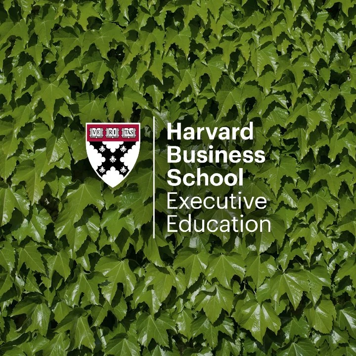
Another huge rebranding job! For Harvard, I was tasked with developing and implementing a system to apply the new Harvard Logo and branding elements across an enormous range of deliverables.
An enormous rebranding job. Originally, the Florida supermarket chain, Kash-n-Karry, needed a new name and logo. After successfully completing those tasks the floodgates opened and I was lucky enough to be in the catbird seat to extend my designs into interior design/decor, packaging, employee uniforms and beyond. By far the best client I've ever had the pleasure to work with (He currently heads up LL Bean - Steve Smith).
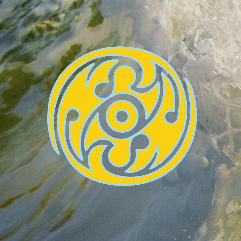
A customized fabricator of high performance surf kayaks. The emblem is inspired by the tribe-like nature of the clientele, and is based on the harmony of the Yin/Yang form as well as the flow of crashing surf.
Concept / Design / Application
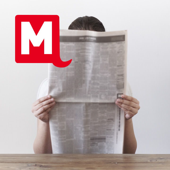
MassLive.com is Western Massachusetts’ most popular local news and information site and the third largest news website in Massachusetts. They wanted an updated identity that communicated their online nature. The mark I created did this, but more importantly it also solved the (unspoken) problem of defining the correct meaning of the word "MASS" by recreating the shape of Massachusetts.
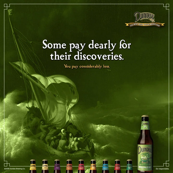
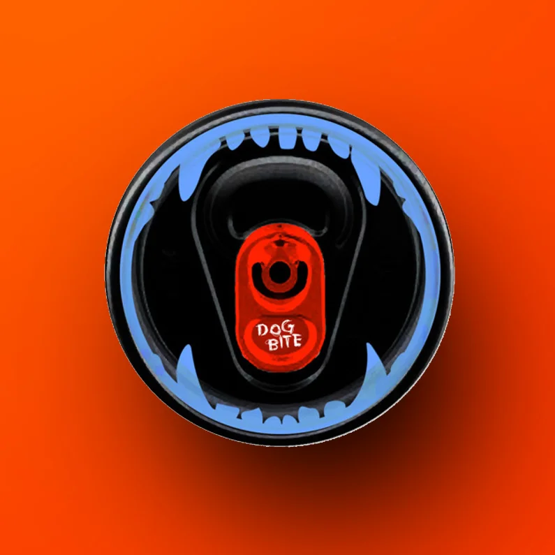
At 10% alcohol content, this beer has a LOT of bite. Developed by the Genesee Brewing Company for the urban market, the logo and package design is intended to appeal to macho men who want more "bang for the buck" - done.
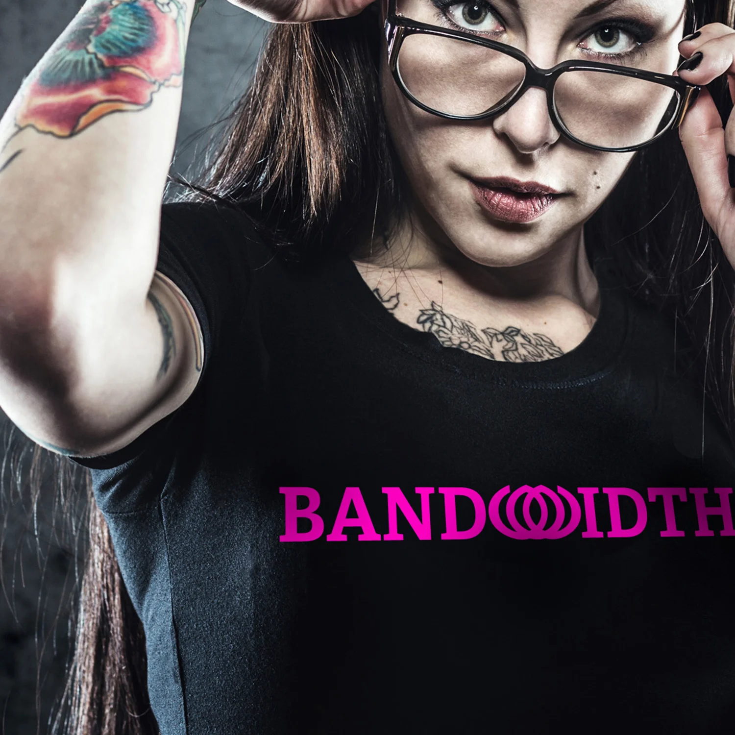
Inspired by the lotus flower, this mark was created to communicate the purity of signal that is achieved through Bandwidth's proprietary technology. It also resembles waves/signals emitting out from a centralized source, or even a stylized crown - whichever of these visuals you see, each one upholds the attributes of the brand and make for a mark with timeless appeal.
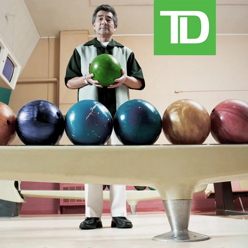
Beginning with a massive, visually bold acquisition campaign, the bigger challenge I had to solve for TD Banknorth (now TD Bank) was to integrate that style across all of its many materials and mediums, including their debit and credit cards (convincing them to use transparent card material to embody their brand promise - clear and simple transactions with no hidden agenda).
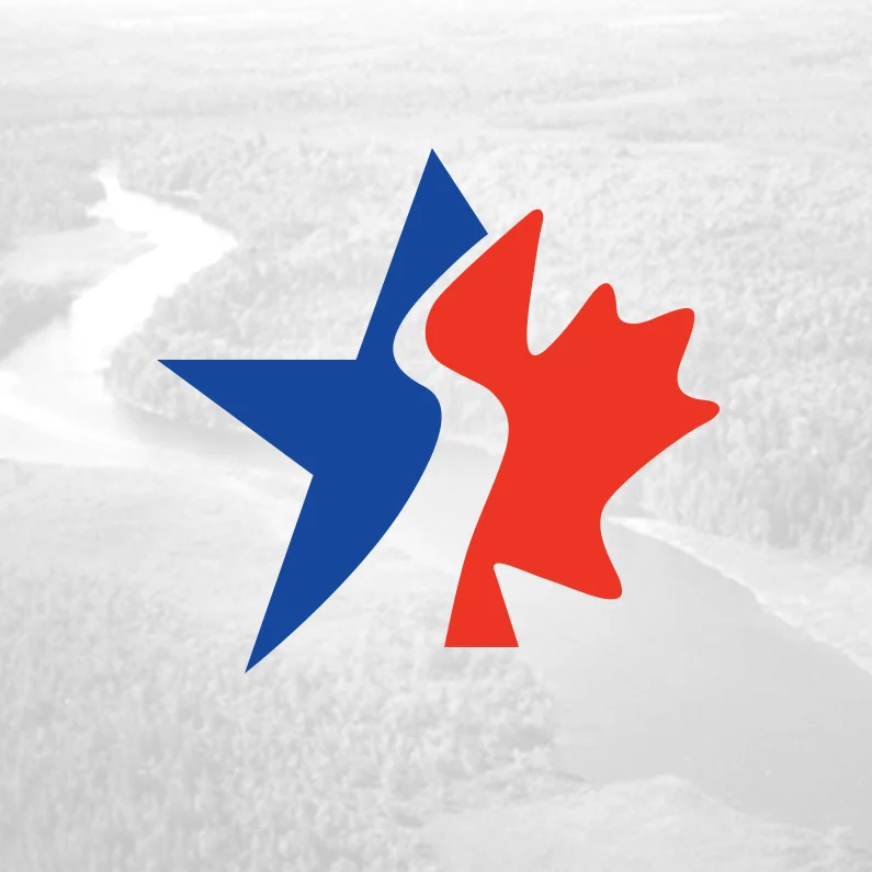
Defining the border between the Eastern part of the United States and Canada, The Saint Croix River is depicted as an ‘S’ letterform in this logo. By then utilizing symbols commonly associated with each country, this logo effectively communicates the nature of this landmark visually, without the language problems typically encountered in these types of situations.
Concept / Design / Implementation
This program identifier was created to act as both a complimentary mark to the master brand as well as a way-finding system.
(Currently In Testing)
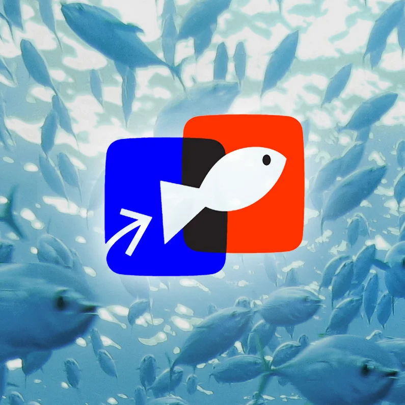
Gofish.com was an early b2b e-marketplace that allowed fishermen, restaurants and grocers to buy and sell seafood. For the first time, it allowed a fisherman in Thailand to sell black tiger prawns directly to a restaurant buyer in Chicago, as well as providing valuable credit information so the seller knows he'll be paid. It also gave online subscribers the latest seafood news and detailed weather reports.
Tactical campaign to introduce a $1,000,000 sweepstakes that you enter every time you make a purchase.
Concept / Design / Layout
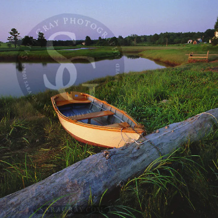
Sara is a super-talented photographer that specializes in images of the natural landscape for commercial and editorial clients.
Sara had an extensive stock image collection (on film) which I was able to organize, digitize, catalog and serve to the public with a fully bespoke website. Amazingly, this site is still active after 10+ years of its creation (that must be some kind of record)!
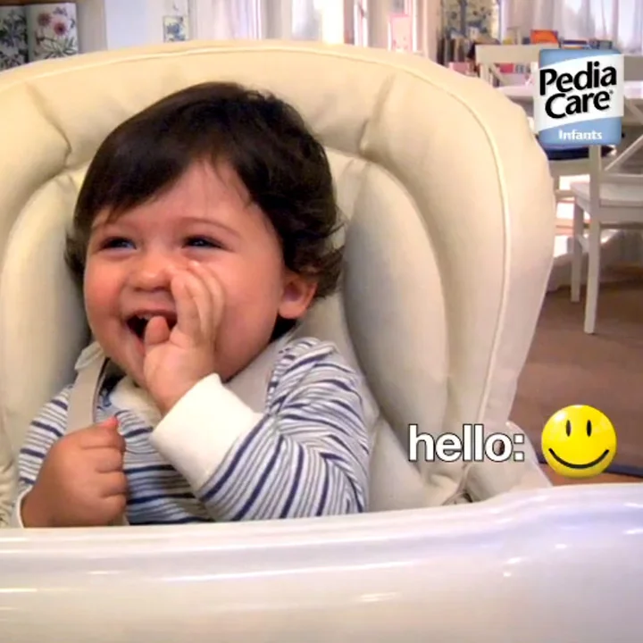
Created to have a natural, candid, quality; these ads showcase healthy kids having fun after having been ill just a short time ago. Bold colors and strong branding compliment the raw, snapshot feeling of the images.
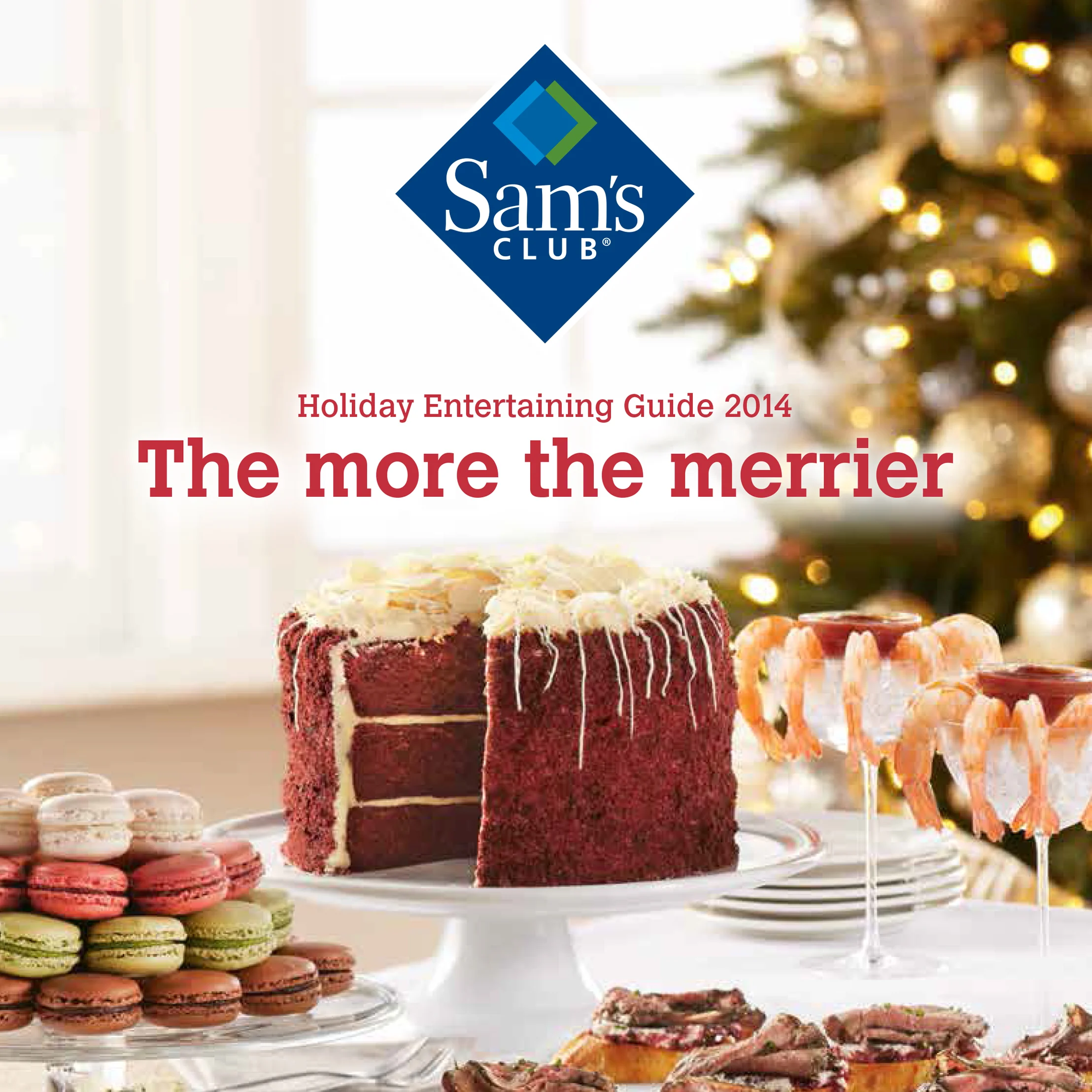
The design challenge was quite daunting for this first "magalog" created for Sam's Club: Combine party planning info with as many food offerings as we could fit. For 6 different types of events (ranging from brunch to office parties). The result was worth the (considerable) effort.
Layout Design / Art Direction / Info Graphics / Photo Direction
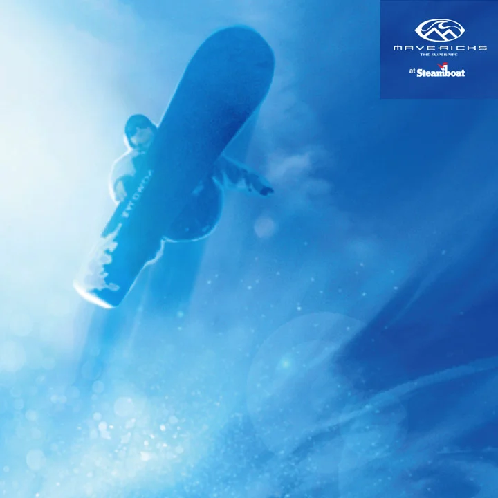
Mavericks is the longest superpipe in North America. Steamboat wanted to promote the the amount of air that was attainable - and use their sponsored team of pro's to do it. So i created a campaign that visually appears to be shot from underwater, looking up at the soaring superstars.